

Navigating the Scatterplot
The scatterplot is the main visualization area where proteins appear as points. Learn how to navigate, select, and explore your data.
Quick Reference
| Action | How |
|---|---|
| Zoom in/out | Mouse wheel or pinch gesture |
| Pan | Click + drag on background |
| Reset view | Double-click on background |
| Focus a category | Hold Shift and hover a point |
| Select one | Click a point |
| Add to selection | ⌘/Ctrl + click another point |
| Deselect one | Click it again, or use the search box |
| Box select | Click Select, then drag a rectangle |
| Lasso select | Switch to lasso tool, then draw freeform |
| Clear selection | Press Escape or click Clear |
| Exit selection mode | Press Escape (when no selection) |
| Focus search | ⌘/Ctrl + K |
Navigation
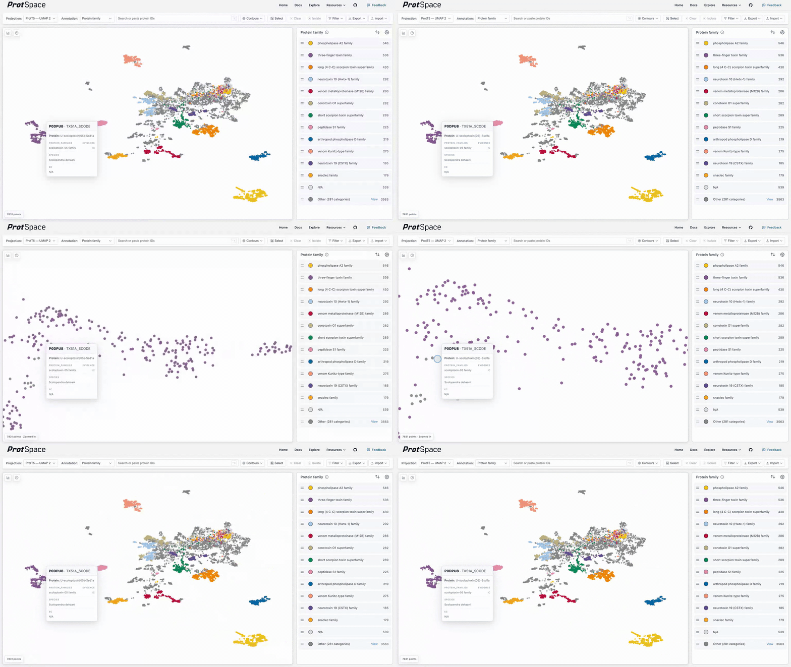
- Zoom: Scroll wheel or pinch gesture
- Pan: Click and drag on the background
- Reset: Double-click the scatterplot to fit all proteins
Dots grow as you zoom in, so single proteins stay easy to see and to hover: a dot's radius is ×1.4 at 4× zoom, ×2 at 16×, and never more than ×4. Zooming out never shrinks them below their unzoomed size, which you set with the shape size in the legend. Until you pick one, it follows the dataset's protein count: 10 up to 10,000 proteins, smaller for larger datasets. Dots are also a little larger on a big plot and a little smaller on a small one (×0.8 to ×1.5 against a 1000 × 700 px plot), and the same size on every pixel density. Hovering picks a dot anywhere within its drawn radius, or within 4 px of its centre when it is smaller than that.
To see where categories concentrate when their points overlap, turn on Contours.
Selection
Single & Multi-Select
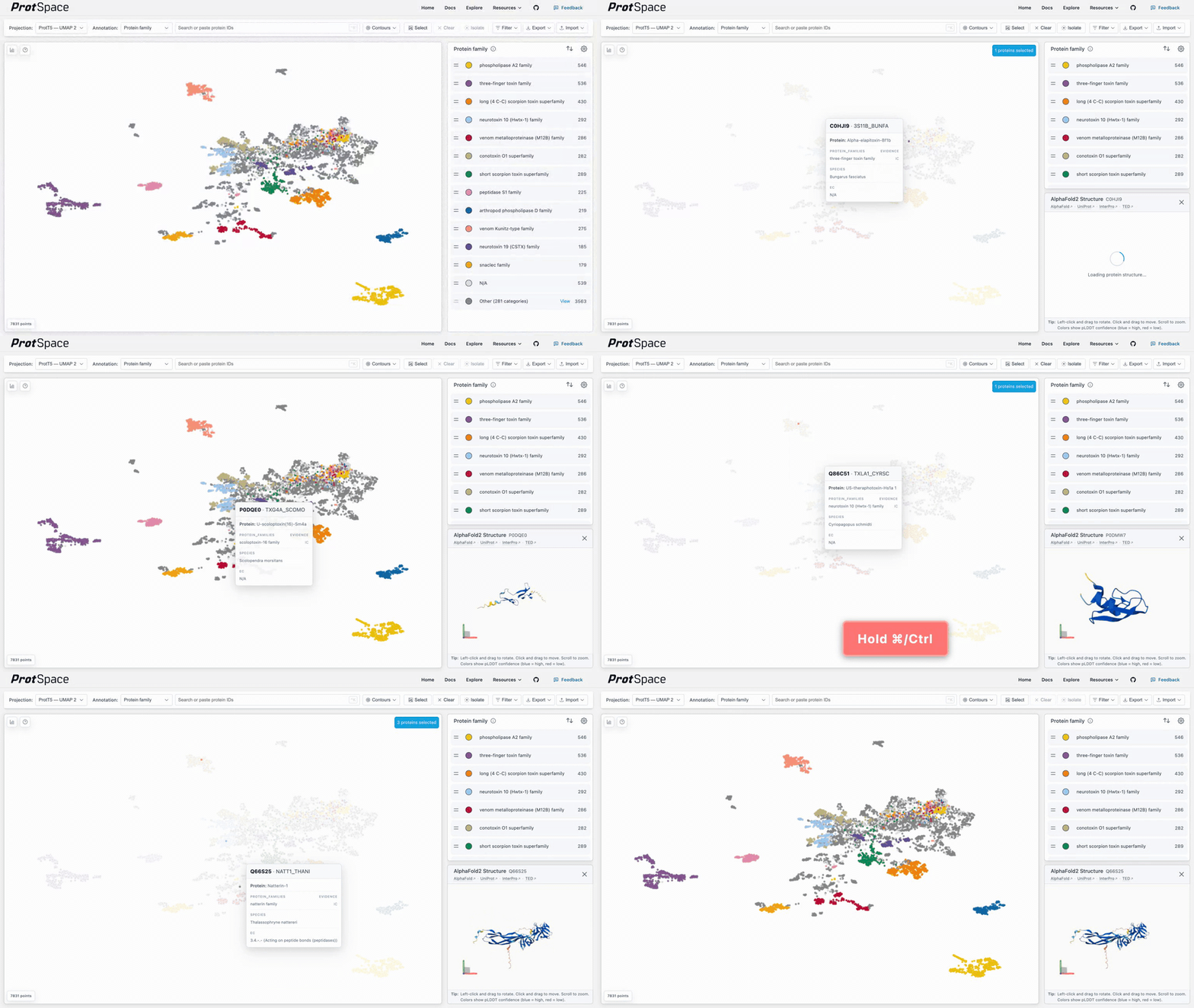
- Click a point to select it
- ⌘ + click (Mac) or Ctrl + click (Windows) to add to selection
- Click the same point again to deselect it
- Click a
✓-marked suggestion in the search box to deselect it
Box Selection
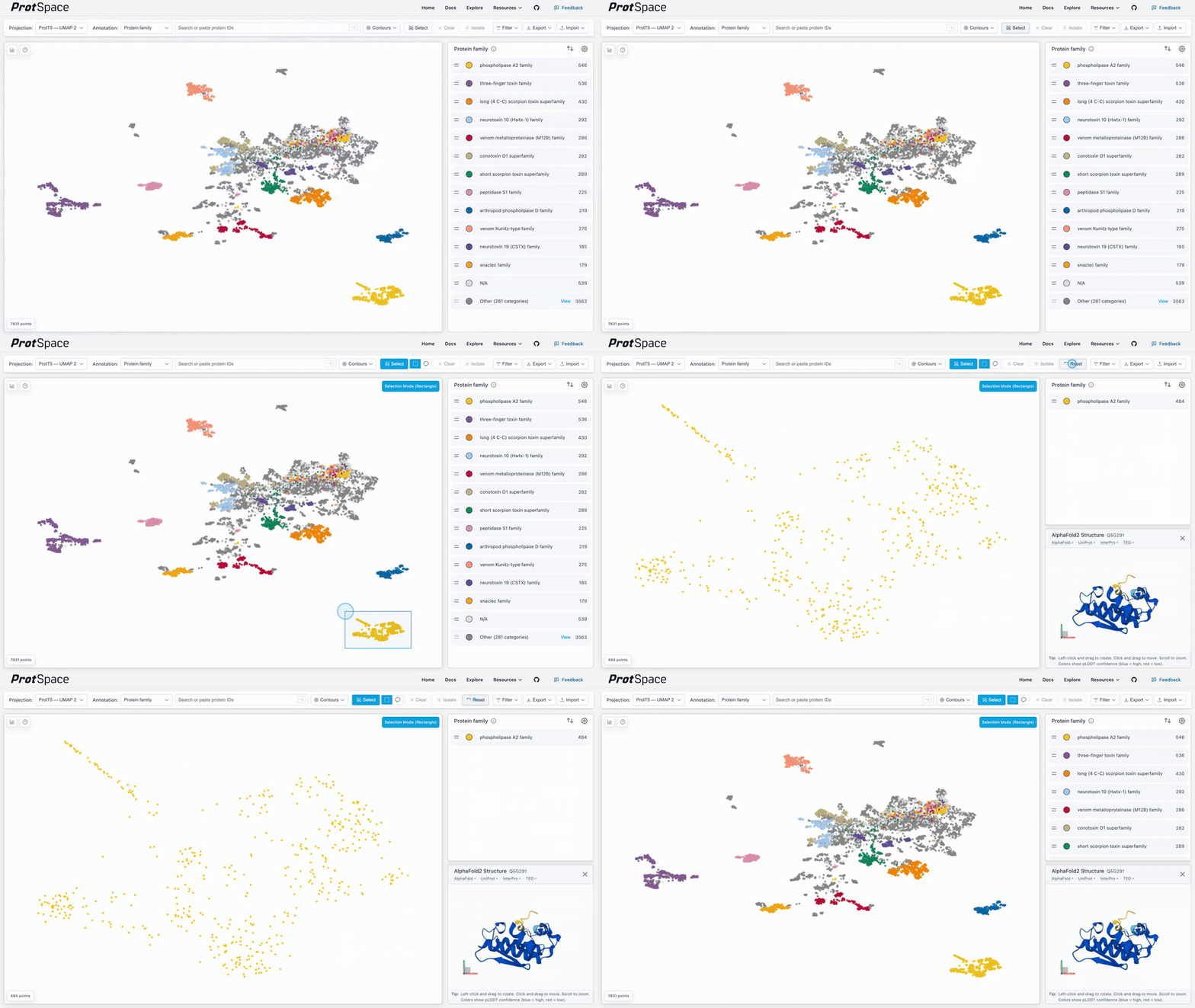
- Click the Select button in the control bar
- Drag to draw a rectangle
- All proteins inside are selected
Lasso Selection
- Click Select to enter selection mode
- Click the lasso icon in the tool picker that appears
- Click and drag to draw a freeform outline around proteins
- Release to select all enclosed proteins
The lasso requires at least 3 points to form a valid selection area. Switch back to the rectangle icon at any time.
Additive Mode
When the Select button is active, all selections (clicks, box drags, and lasso draws) are additive. Without it, each new selection replaces the previous one.
Clearing
- Press Escape to clear selections (first press), then exit selection mode (second press)
- Click the Clear button
Understanding the Display
Point Position
Points close together have similar embeddings - often indicating similar structure, function, or evolutionary history.
Point Colors
- Categorical (reviewed, protein family, species): Unique color per category
- Multi-label (EC numbers, domains): Pie charts showing multiple values
Protein Tooltip
Hover over a point to see a tooltip with details about that protein:
- Protein ID and UniProtKB ID (if available)
- Protein name and Gene name (if available)
- Annotation values for the currently selected annotation
- Scores (for InterPro domain annotations, e.g., E-values) or evidence codes (for GO terms, subcellular location, etc., e.g., EXP, IDA)
Protein name, gene name, and UniProtKB ID are tooltip-only and don't appear in the Annotation dropdown.
Focusing a Category
Hold Shift while hovering a point to see where its category sits: every protein sharing one of its values in the current annotation stays bright, everything else fades. Move to another point to switch category; release Shift or move off the point to go back.
- Hovering a point in the legend's Other group focuses the whole group
- Hidden legend values stay hidden, and the tooltip is hidden while focusing
- Focus is only a preview: it does not change the selection, and it is off while proteins are selected
Duplicate Points
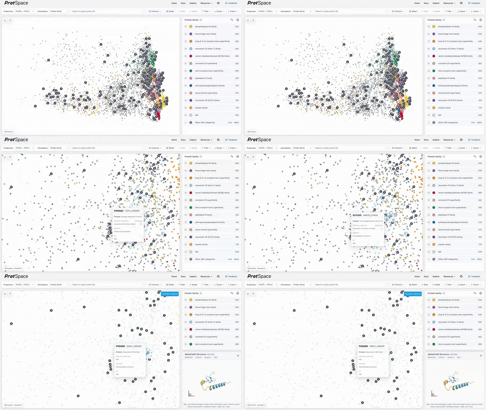
When multiple proteins share the exact same coordinates, a count badge appears on the point (when enabled in the legend settings). Click a stacked point to expand it into a spider layout showing each individual protein.
Projection Metadata
A small bar-chart icon sits in the top-left corner of the scatterplot. Hover it (or focus it with the keyboard) to open a Projection Metadata panel describing the current projection. Click the icon to pin the panel open, so you can scroll it and read the ⓘ popovers inside without keeping the pointer on the card. Escape or a click outside closes it; switching projections updates it.
TIP
The icon only appears when the loaded bundle has something to show: reduction parameters, faithfulness metrics, or statistics for the annotation you are colouring by, either its separation in this projection or, for a clustering, its Recovers table. Any one is enough, so a bundle prepared with --stats but no projection metadata still gets a panel, and a clustering found in another projection gets one on Recovers alone. A bundle carrying none of them shows no icon at all.
The card's header is the projection's own name. Below it, in order:
- Separation, scored on
<annotation>, how cleanly the current annotation's categories separate in this projection, with the source embedding's own scores beside them as a reference. Documented on Separation Scores. - Recovers, only when the current annotation is a
cluster_elbow_*/cluster_silhouette_*clustering: how closely that clustering reproduces each real annotation. Documented under Cluster Annotations. - Faithfulness to the embedding, described below.
- How it was made, described below.
Faithfulness to the embedding
How well the 2D or 3D layout preserves the structure of the original high-dimensional embedding, as one labelled row per metric under two group headings. Every row carries its value and its own ⓘ popover.
Local — are the same proteins still neighbours?
- kNN Overlap, fraction of each point's k nearest neighbors preserved in the projection
- Trustworthiness, penalizes points pulled together in the projection that were far apart
- Continuity, penalizes points pushed apart in the projection that were close together
Global — is the overall layout preserved?
- Random Triplet, fraction of random point triplets whose relative ordering survives
- Spearman Distance, rank correlation between high-dimensional and projected pairwise distances
The neighborhood size k, the high-dimensional distance metric, and the source embedding are the same for every metric, so no row repeats them: one scope line covers all of them, such as 811 proteins compared, gaining · subsampled when the comparison ran on a subsample. These metrics travel in the projection metadata (info_json.quality), not in the statistics part, so they appear whether or not the bundle was built with --stats.
How it was made
The parameters the dimensionality-reduction method was run with, read from the bundle's projection metadata table. Source names the embedding the projection was computed from, which is useful when a bundle contains projections from several embeddings. The rest depend on the method:
- PCA,
N Components, plusExplained Variance Ratio(one value per component) - UMAP,
N Neighbors,Min Dist,Metric,Random State, and the rest of the UMAP parameter set
Two things are deliberately absent from the list: the dimension count, which you already pick in the Projection selector, and the projection's name, which is the card header rather than a row.
Across the whole card
Values anywhere on the card are formatted for readability: whole numbers print as-is, other numbers are rounded to three decimals (two for explained-variance values), booleans show as Yes/No, lists are comma-separated, and a value that is missing or could not be computed shows as N/A.
Whenever the card carries any scores at all, separation or faithfulness, it ends with a footer reading All scores are for the full dataset., becoming All scores are for the full dataset, not this view. while a filter or isolation narrows the plot, for the reason on Separation Scores.