

Transferred Annotations (EAT)
Most annotation columns have holes in them. A protein that nobody has characterised has no EC number, no family, no GO term, and colouring by that column leaves it in the N/A bucket where it says nothing at all.
Embedding Annotation Transfer (EAT) fills those holes by borrowing. For every protein missing a value, it finds the nearest annotated protein in the original high-dimensional embedding space (not in the 2D layout you are looking at) and copies that protein's label across, along with a reliability index in [0, 1] and the identifier of the protein it came from.
The borrowed values never overwrite anything. They live in their own columns, so a transferred value and a curated value are two different facts about a protein and the interface keeps them visibly apart. A bundle that carries predictions shows them by default, with nothing hidden by reliability, so your first view already includes every borrowed value.
Predictions are made before you open the dataset
Transfer runs in the Python CLI, not in the browser: protspace transfer writes the prediction columns into a bundle. Nothing on this page creates predictions, it only shows the ones a bundle already carries. See protspace transfer for the command and its options.
The Three Columns
For a curated column COL, transfer adds three companions and leaves COL itself untouched:
| Column | Holds |
|---|---|
COL__pred_value | The borrowed label. |
COL__pred_confidence | The reliability index, 0 to 1. The interface also calls this the EAT confidence. |
COL__pred_source | The identifier of the reference protein the label came from. |
A protein that already had a curated value gets no prediction at all, so the three columns are populated only where COL was empty.
Finding Them
Annotations carrying predictions are marked with an EAT badge in the Annotation dropdown, beside the annotation's name. The badge appears only for columns that have at least one transferred value, so it doubles as the list of what is worth exploring. If no annotation carries the badge, the bundle has no predictions in it.
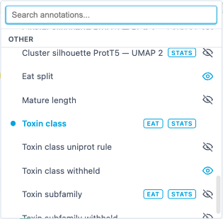
This is not the ⚡ Predicted badge, which marks a whole column as computational based on its name. An EAT badge means the opposite: the column is curated, and only some of its cells were filled in. See Predicted Annotations.
Select a badged annotation and the legend grows an extra section at the top.
The Legend Section
At the top of the legend panel, above the separation strips and the category list, a block titled Predicted (transferred) appears whenever the annotation you are colouring by has predictions. It holds three things.
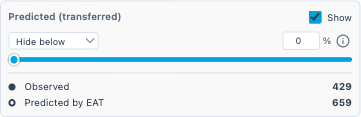
Show turns the overlay on and off. It is on by default. With it on, every transferred protein is coloured by its borrowed value and joins that value's legend row, so the row counts and the plot both reflect the filled-in column. Turn it off and those proteins fall straight back to their curated cell, which is empty, so they return to N/A. The curated data is never modified, so toggling is cheap and lossless.
The reliability filter is a mode dropdown — Hide below, Hide above, Keep between — with a slider and a matching % number input. Both drive the same bound, Keep between adds a second one, and all of them are disabled while Show is off. See Filtering By Reliability below.
The counts sit underneath, and only while Show is on: Observed against Predicted by EAT. Each carries a swatch encoding the distinction the plot uses, filled for observed and hollow for predicted. The swatches are always drawn as circles; in the plot each marker keeps its own category's shape and colour. Proteins that have neither a curated value nor a prediction are in neither count.
Telling Them Apart In The Plot
A transferred protein is drawn as a hollow ringed marker: its shape and its colour are exactly those of the value it borrowed, but the interior is punched out, leaving a ring. Curated proteins stay solid.
This means the two populations read as one distribution at a glance, since the colours match, while any individual point still declares which kind it is. The ring thickness scales with the marker, so from Shape size 10 up the hole stays open and the ring never thins to a hairline on large markers. Only at the smallest sizes, where a dot is a few pixels across, can the hole shrink below a pixel. Large datasets default to such sizes, so raise the shape size there if the rings are hard to tell apart.
Hover a transferred protein and its tooltip carries a Predicted (transferred) block for the active annotation: the reliability as a percentage, a bar showing the same number, and the line Reliability index · source <ID> naming the reference protein the label was copied from.
Three things are worth knowing about when the rings appear:
- Only for the annotation you are currently colouring by. A protein can carry transfers for several columns; only the active one is drawn.
- Only while Show is on.
- In exported images too. The live renderer and the export renderer share one shader, so a PNG or the Figure Editor output keeps the same solid/hollow distinction.
A ringed marker is a guess
Hollow means "no curated value existed and this is the nearest neighbour's label". It is an inference from embedding geometry, not evidence. Read a hollow cluster as a hypothesis about that region of the map.
Where A Prediction Came From
Provenance is also drawable. With the overlay on, clicking a point in the plot traces the transfer as dashed lines, in whichever direction makes sense for the point you clicked:
- Click a transferred protein and one dashed line joins it to its source, the protein whose label it borrowed for the currently active annotation.
- Click a source protein and dashed lines fan out to every protein that borrowed from it.
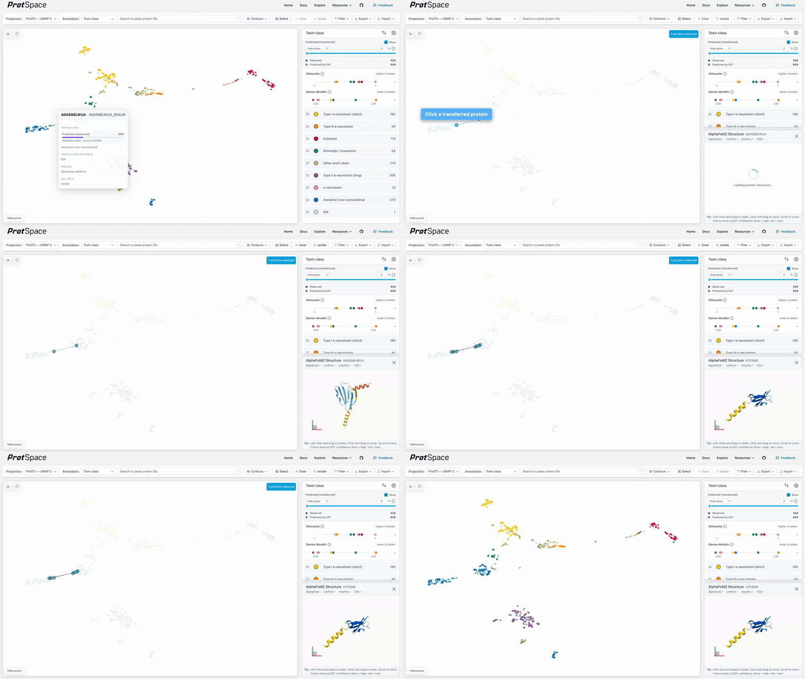
A protein that is both a transferred protein and a source for others takes the first case: only its own source line is drawn. If that source's legend category is hidden, the click draws nothing at all.
Endpoints get an unfilled halo so you can find the termini without the emphasis covering the markers underneath. Clicking still selects the protein exactly as it always did: the connectors are drawn on top of normal selection, not instead of it.
A heavily reused source can have hundreds of dependants, so the fan-out is capped at 20 lines, taking the highest-confidence targets first with the protein identifier as a deterministic tie-break. Candidates whose legend category is hidden are excluded outright. Candidates that exist but are currently off-view, removed by a filter or by isolation, are reported instead of drawn: a small status strip appears at the bottom of the plot reading 3 hidden (off-view) with a × to dismiss it. It shows only when something is actually missing, so a fully drawable click is silent.
Connectors are transient state and clear on Escape, on the status strip's close button, on clicking empty plot space, on clearing the selection, on changing the annotation, on toggling a legend category's visibility, on turning Show off, and on loading new data.
They do survive everything that only changes the view. Connectors hold protein identifiers rather than coordinates, so switching projection (ProtT5 — PCA 2 to ProtT5 — UMAP 2, say), flipping a 3D plane, panning, zooming, filtering, or isolating re-resolves both endpoints against the new layout rather than dropping the lines. An endpoint that a filter removed comes back as a line when the filter is cleared, without a second click.
Reading The Reliability Number
The reliability index is a transform of the distance to the reference protein: closer neighbour, higher number. Its exact form depends on the --metric and --k used at transfer time, and the reliability index section gives the formulas.
Rank, not probability
With the default cosine metric the reliability index is a bounded cosine similarity; with --metric euclidean it is the goPredSim transform, which was calibrated on ProtT5. On other embedding spaces, whose raw distances can be on a very different scale, treat it as a way of ranking predictions against each other rather than as a probability that the label is correct. A 0.9 is more trustworthy than a 0.6 in the same dataset, but it is not a 90% chance of being right. Values produced with different --k settings are not comparable at all.
Filtering By Reliability
The reliability filter hides predictions whose confidence falls outside the range you choose. It starts at Hide below 0, meaning nothing is hidden, and the slider and the % box are two views of the same number.
The mode dropdown picks which side of the confidence scale to cut:
| Mode | Keeps | Typical use |
|---|---|---|
| Hide below | predictions at or above the bound | keep only the predictions you trust |
| Hide above | predictions at or below the bound | inspect the weak predictions — where the transfer struggled |
| Keep between | predictions inside the band, ends included | isolate a confidence band to compare like with like |
All three modes share one control: a single track carrying one handle per bound the mode actually filters on. Hide below and Hide above have one handle each, Keep between has two. A bound a mode ignores has no widget at all, so every number on screen is a number that is filtering.
The coloured part of the track is always the part you keep — to the right of the handle in Hide below, to its left in Hide above, and between the two in Keep between.
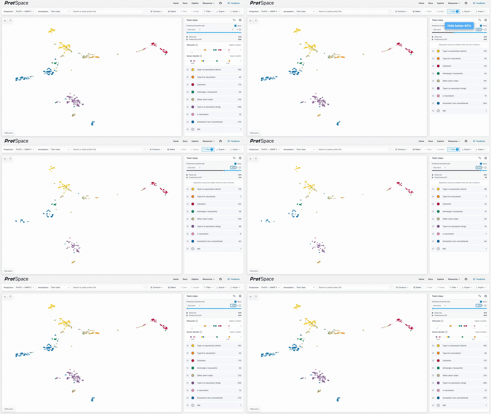
Curated values are never affected in any mode. The filter applies only to transferred cells, so tightening it leaves the observed data whole. This is a different outcome from turning Show off: Show returns transferred proteins to N/A, while the filter removes them from the view the way any other filter condition does.
The control is a front end for an ordinary filter. Moving it off its neutral position writes a single condition into the filter query on a numeric column the app synthesises at load time for each transferred annotation:
Hide below x      ->  <annotation> — EAT confidence >= x        or N/A
Hide above x      ->  <annotation> — EAT confidence <= x        or N/A
Keep between a, b ->  <annotation> — EAT confidence between a,b or N/A
The trailing or N/A is what keeps curated proteins visible: they carry no confidence score, so no comparison can match them, and the condition has to say so explicitly.
The mirror runs both ways: edit or delete that condition in the filter builder and the control follows, whichever comparison operator you used and wherever in the query it sits. Each transferred annotation gets its own condition, so tuning one does not disturb another, and your unrelated filter conditions are left alone.
The EAT confidence column is filter-only
<annotation> — EAT confidence is not offered in the Annotation dropdown, because colouring by it would say nothing about the proteins that were never predicted. It exists in the filter column picker, where a raw confidence threshold is what you actually want. It is synthesised on load and is not written back into exported bundles.
Because this is a real filter, it interacts with everything else that responds to a filtered view. In particular the separation score strips hide themselves while any filter is active, the reliability filter included, since whole-dataset scores would contradict a narrowed view.
Exporting a bundle with settings included stores the Show state and the lower bound, so a dataset shared from Hide below reopens on the same view. The mode and the upper bound are not stored yet, so the other two modes do not survive a round trip: Keep between reopens as Hide below at the band's lower edge, keeping everything above it, and Hide above reopens with no filter at all — it has no lower bound to store, so the saved value is 0. Re-pick the mode after loading such a bundle.
Trying It
The Snake three-finger toxins (EAT) example holds 1,089 three-finger toxins from snakes. UniProt curators have classified 536 of the 537 reviewed ones; the one left, the muscarinic toxin Mlalpha (P0DJB0), has no curated subfamily and shows as N/A. The 552 unreviewed ones, mostly sequenced from venom glands, have no class, and EAT transferred one to each from the nearest reviewed toxin in the ProtT5 embedding. To make the transfers checkable, a fifth of the reviewed toxins, 107, were held out: their class was withheld and transferred like the others, and toxin_class_withheld keeps the truth.
Open the Import menu's Examples section and choose it, or visit /explore?dataset=three-finger-toxins directly. Its section of Example Datasets says how it was built.
It opens coloured by toxin_class with every transfer shown: the 659 rings, one for each unreviewed and held-out toxin, sit in the islands of the classes they borrowed. The reliability filter starts at 0, which also keeps the separation score strips visible. Hover a held-out toxin (colour by eat_split to find them) and its tooltip shows the borrowed class next to toxin_class_withheld; they agree for 101 of the 107 held-out toxins (94 %). Drag the filter to 50 % (a reliability of 0.5) to keep the 407 transfers EAT was most confident in, 312 onto unreviewed toxins and 95 onto held-out ones, all 95 of them right. The rings between the islands go first.
Next Steps
- Using the Legend - the panel the EAT section lives in, and per-category visibility
- Control Bar Features - the annotation dropdown and the filter query builder
- Using Python CLI -
protspace transfer, its flags, and the reliability formulas